Nonprofit website redesign for A Family for Every Child.
Dedicated to finding loving, permanent families for every waiting foster child.
Before
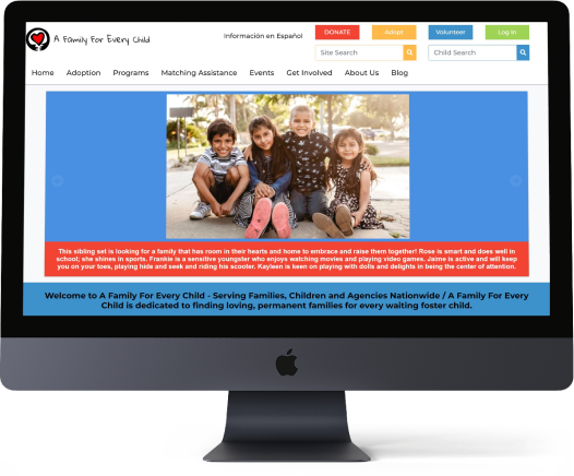
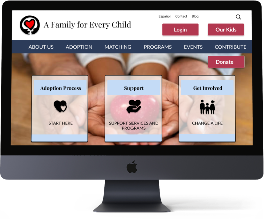
After


Interviewed five people, men & women, all over the age of 30 via Zoom. Experience ranged from no direct knowledge to actively fostering children.

“If I were to adopt, I would want to be a part of a community that had experience, to make sure we had access to counseling & support.”
~Couple Interested in Adoption

“Social workers are overwhelmed so having a support system and a mentor is crucial.”
~ Veteran Foster Parent of 5 Years

insight #1
SUPPORT IS KEY
Adopting a foster child is a life-changing decision that requires sustained involvement and support. Without a support system, a large percentage of people drop out.
Placing a “Support” card front and center on the redesigned website makes it easy to find. Rebranding the website to look more professional, instills confidence in users. Updating the site map makes navigation simple.

insight #2
PROCESS OVERWHELMS
The foster adoption process can be long and take many turns before it’s complete. A potential foster parents needs to have an experienced and trusted guide to lead them through the process.
The “Adoption Process” card on the home page gives users an easy way to educate themselves. The site map was massively simplified so users wouldn’t get overwhelmed.

insight #3
WAYS TO HELP
Not everyone is interested or able to foster adopt, yet many have a heart for foster children. They would like other ways to become involved and show their support.
Events, programs, ways to volunteer and donate are some of the ways users can help. All the options are found through the “Get Involved” card on the home page.

OTHER RESEARCH
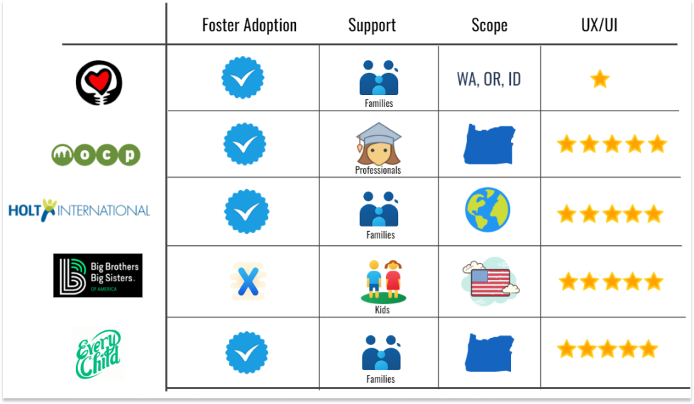
Stakeholder Interview . Google Analytics . Heuristic Evaluation . Proto Persona . Affinity Diagram . Empathy Map . Feature Prioritization Matrix


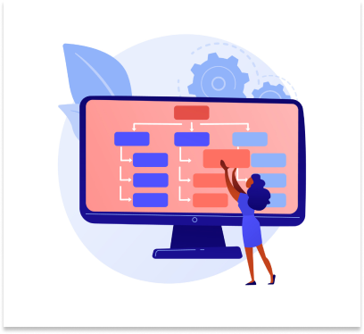
INFORMATION ARCHITECTURE


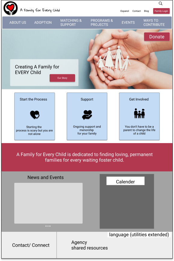
Before Testing
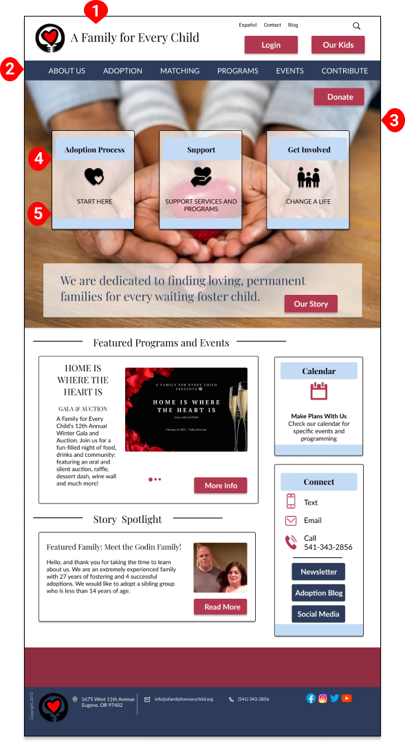
CHANGE #1
LOGO FONT UPDATED
Users found “Playfair Display” more professional than “Gloria Hallelujah”. Finalized logo font to Playfair Display.
CHANGE #2
BLUE NAVIGATION BAR
Blue preferred over gray. Described as “sophisticted” and “welcoming”. Incorporated “deep koamara” blue into color palette.
CHANGE #3
DIVERSE HERO IMAGE
Users liked the hands/heart image. Inclusive image of hands holding a heart confirmed.
CHANGE #4
CARDS TRANSPARENT & INTERACTIVE
Transparent background & interactive cards viewed as more fun & sophisticated. Cards kept transparent and animated - Become bigger with a solid background when hovered over.
CHANGE #5
CARDS ABOVE FOLD
Users scanned to find the Process, Support & Involved cards. Moved the cards up & over the hero image for better visual heirarchy.
After Testing
Before Testing
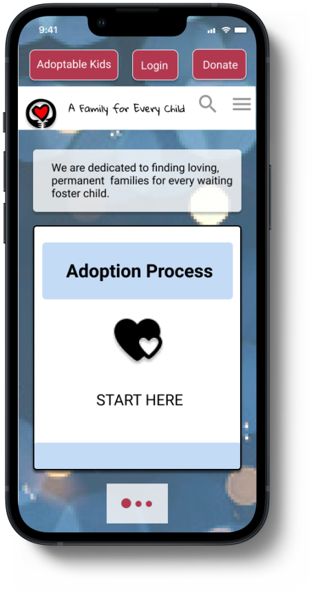

“I think solid cards work better for mobile since everything is smaller.”

“The confetti background feels off tone and too celebratory for this site.”
CHANGE #1
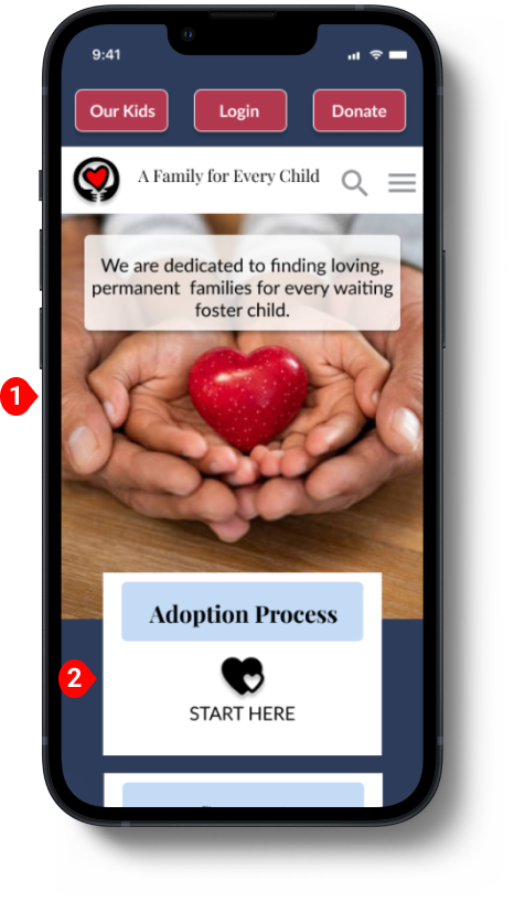
HERO IMAGE CONSISTENT
Users unanimously favored a consistent image across all devices. The hero image matches the desktop.
CHANGE #2
NO CARD CAROUSEL/SOLID CARDS
Preference for no card carousel. Users felt it easier to navigate and a solid background improved readability. To simplify navigation and legibility, the carousel was removed and the cards kept solid.
After Testing

Of the 400,000 children currently in the U.S. foster care system, approximately 117,000 are waiting to be adopted. Many people are curious but scared, overwhelmed and don’t know where to start.
Our hope is that by making A Family for Every Child’s website welcoming, easy to navigate and a wealth of information, we help people open their hearts, minds and homes to kids in foster care. What an amazing opportunity to change a life!