Responsive web redesign for the U.S. Department of Education.
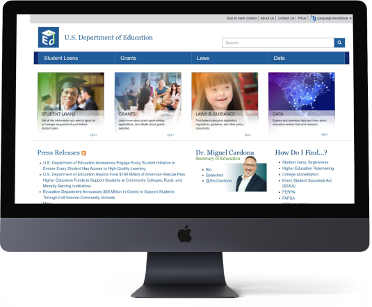
Before
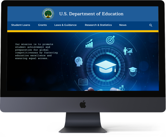
After


BEHAVIOR DEMOGRAPHICS:
GOALS & NEEDS:
PAIN POINTS & SOLUTIONS:

Tested two college freshmen, two parents of college students, and one working professional via Zoom with the following tasks:
 Find information on student loan forgiveness.
 Locate the College Scorecard and look up one college.
 Research how much it costs to attend different colleges.

insight #1
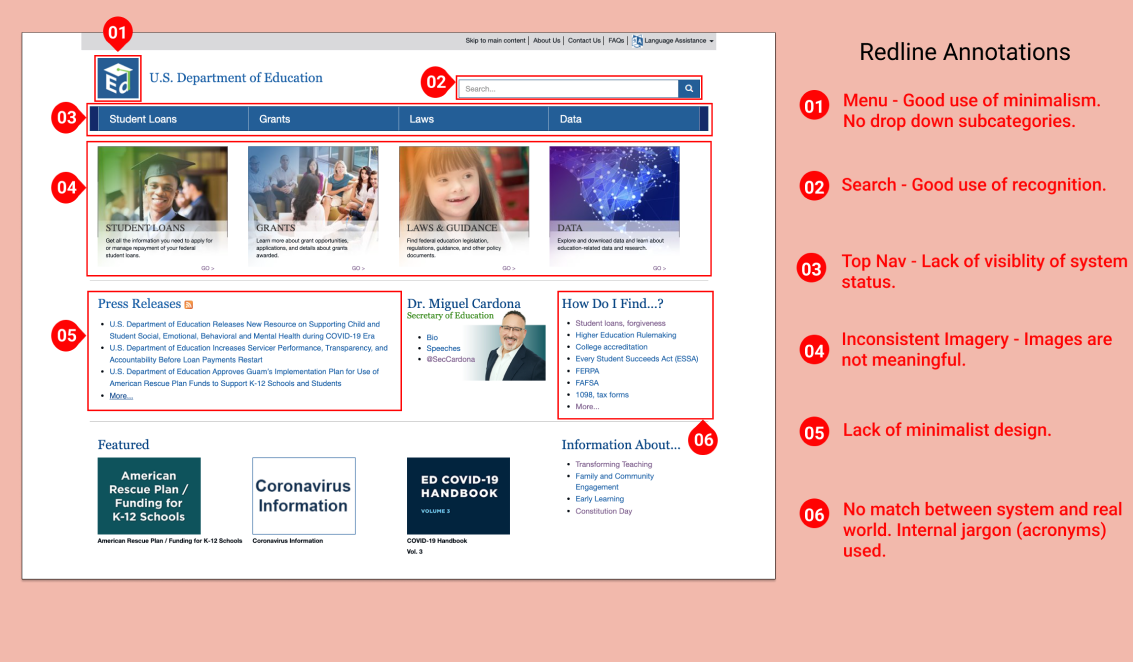
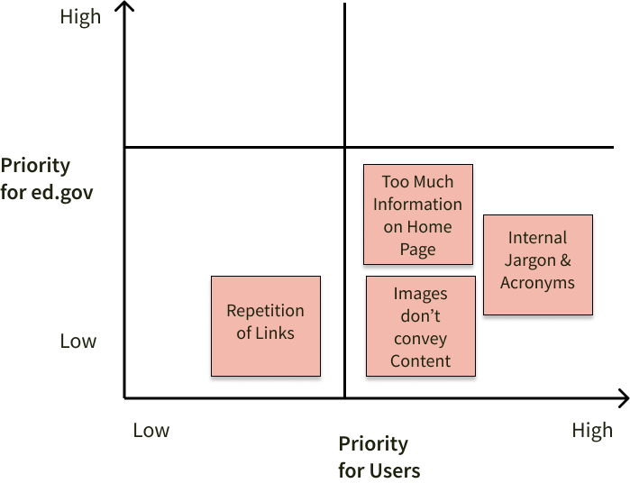
INFORMATION OVERLOAD
An education is a foundational way for people to develop self-dependency and live happy lives. Currently, users are overwhelmed and give up before finding useful information.
Simplify the layout, dramatically decrease text and eliminate repetitive elements to make it easy for users to find what they’re looking for.

insight #2
INTERNAL JARGON
Someone not familiar with a specific term hits a roadblock and will not completely understand what is being discussed. The site’s heavy use of acronyms and internal jargon prevents users from completely understanding the content.
Spell out acronyms and clarify internal jargon so users fully comprehend the subject .

insight #3
MEANINGLESS IMAGES
An image that does not convey the same message as the associated content is perplexing.Many images have no related meaning to the accompanying information and confuse users.
Update all images to visually represent the associated content. The overall user experience will be improved when images send the same message as the related content.
OTHER RESEARCH
Screenshot Flow • Color Accessibility • Card Sorting

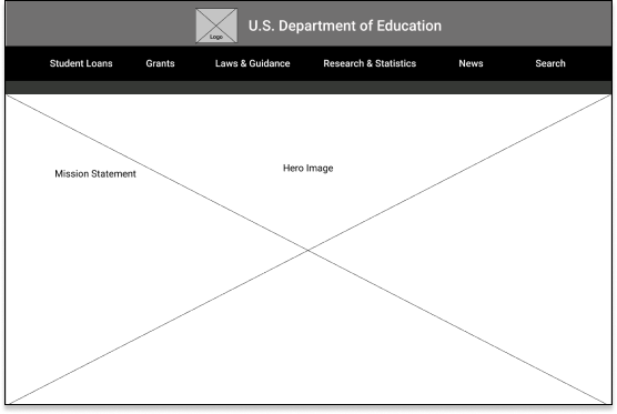
Home Page
Student Loan Page
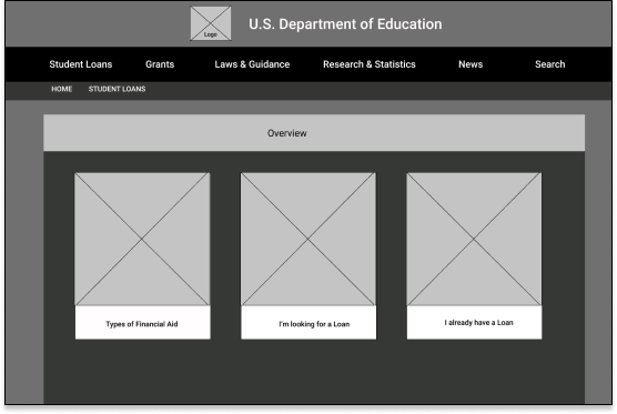
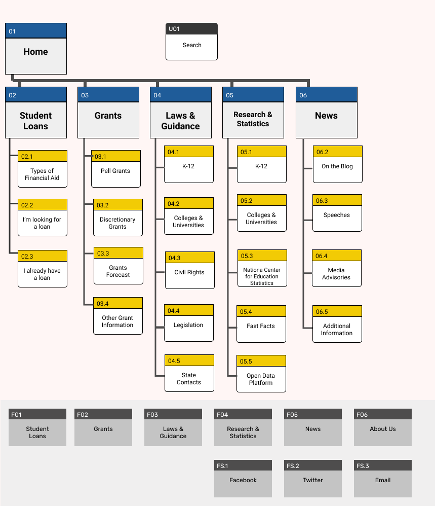
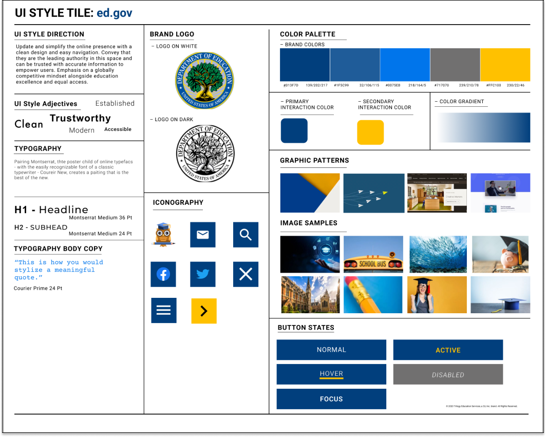
Project Focus: A major part of this project was UI focused - especially navigation.
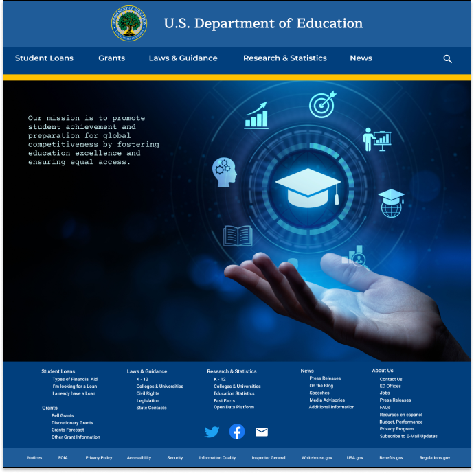

“This is much easier to look at than the current site. I really like the colors and image.”
~ College Freshman

“I don’t know if I can click on the images around the hat. I’m going to try and see what happens”
~Parent
Home Page Hover
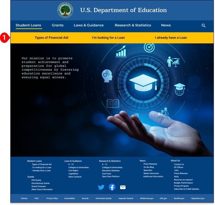
CHANGE CONSIDERED
HERO IMAGE
Two of 5 users were unsure if the hero image icons were clickable. Discussed with Instructor & Tutor and both advised to leave it.
NOTE #1
HOVER MENU LIKED
Student Loans Page Selected
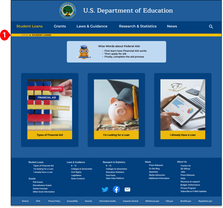

“The pictures and titles really make sense. I immediately know what to click on.”
~ College Freshman

“I really like the “Wise Words” at the top. Those are helpful tips.
~Parent
MINOR CHANGES
SPELLING & CLICKABILITY
Some spelling errors were discovered and a dead end on the clickable prototype. Corrected the spelling and linked the prototype to ensure no dead ends.
NOTE #1
BREADCRUMB EFFECTIVE
Home Page
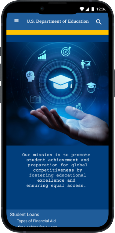
Home Page Menu
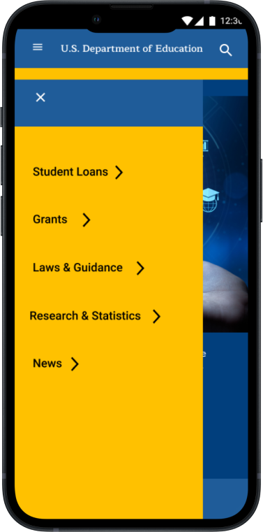
User Test Results: Enjoyed the design and found navigation simple and easy to use.


As the first person in my family to earn a college degree, I understand the amazing impact education has on people, their families, communities and the world.
By redesigning the U.S. Department of Educations’s website to be easy to understand and navigate; users will find the answers they seek to reach their goals!